Amara: Your special encounter.
Brand identity for a multi-concept restaurant in New Jersey - where a cigar lounge, a Mediterranean kitchen, and a steakhouse share one space, one name, and one mark.


Built from
the same grid.
Amara is part of Famiglia La Fontana, an Italian group of restaurants based in New Jersey.
But unlike its counterparts, Amara carries something peculiar - and intentional. In Italian, amara means bitter: the complexity that makes an experience memorable.
So even as it carries the legacy of the family within, it had to be different. Unique. And that's why the symbol carries so much importance - borrowing the grid from La Fontana Restaurants, but making it entirely its own.

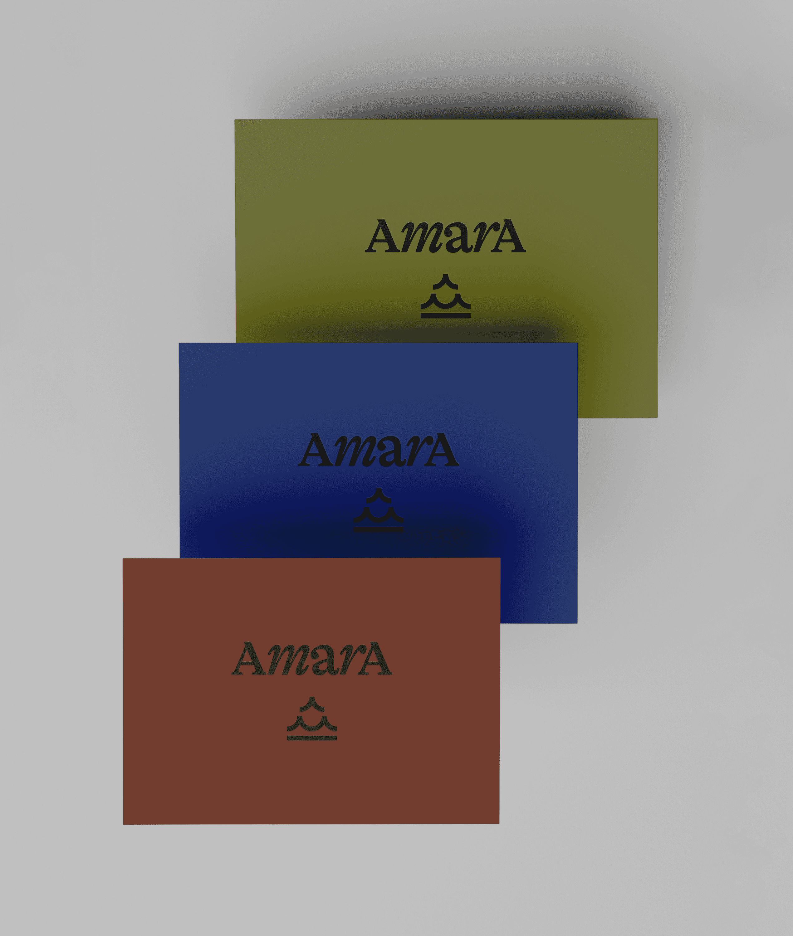
Three meanings,
one mark.
Amara holds three distinct spaces: a steakhouse, a Mediterranean kitchen, and a cigar lounge. The symbol was built to hold all three at once.
Read from bottom to top: a baseline representing earth, two arches for the sea, and a final arch reaching toward fire. Three elements. Three environments. One mark.
The result is immediate and recognizable - a symbol with visual weight, scalable presence, and quietly, almost by accident, the shape echoes the letter A itself.
Mix &
match.
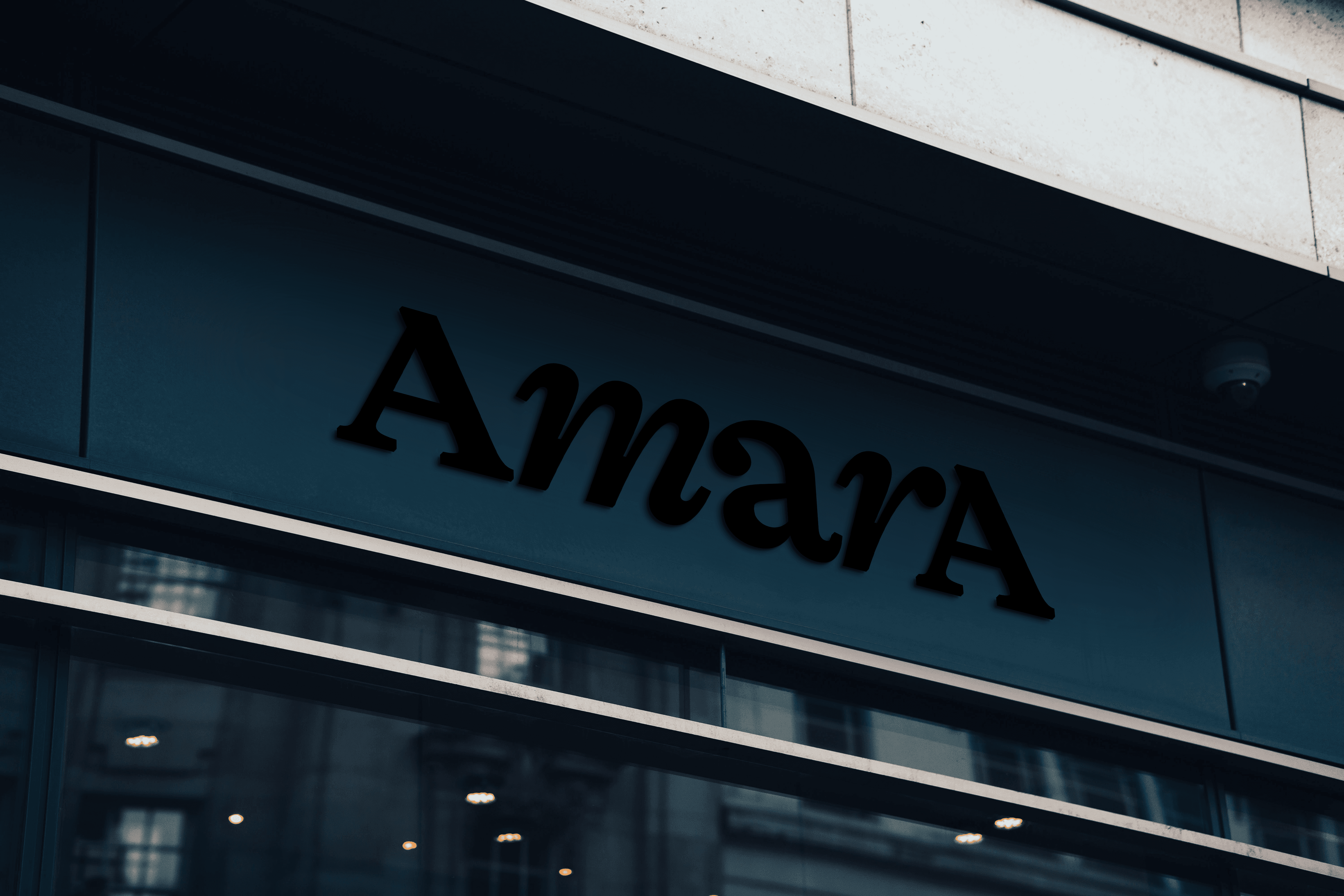
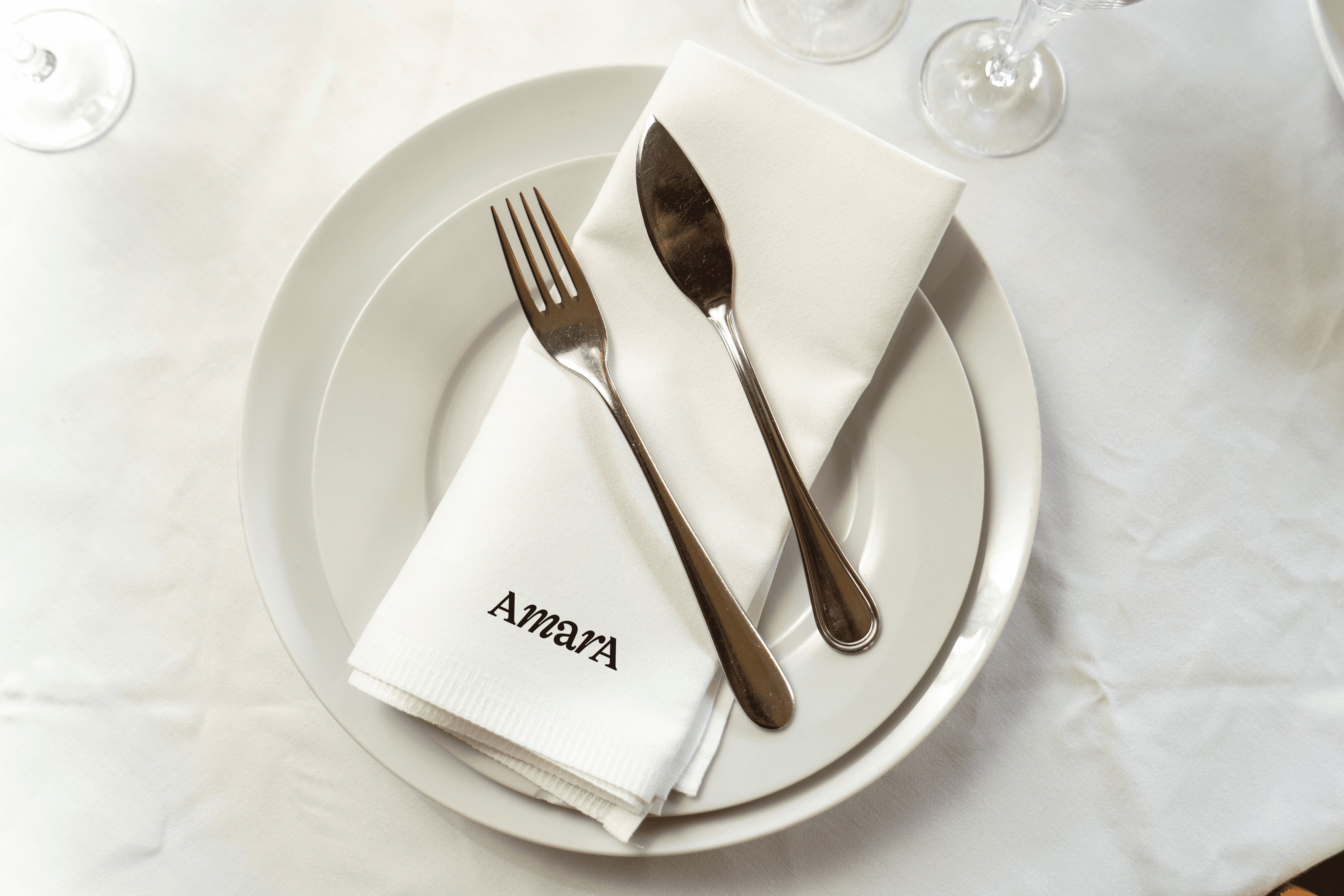
The wordmark uses a serif typeface with refined proportions. But the real decision was in how to set it.
Uppercase at both ends, lowercase in the middle - AmarA. The mix of roman and italic cuts creates a rhythm that feels both structured and alive. Sophisticated, but not rigid.
A single word that already tells you everything about the place.

Amara — Visual Identity, Verbal Identity
@BR/Bauen
Brand Design — 2022


