Cambuí: We brew, ferment, and foster.
Brand identity for a brewpub in Brasília built around a single conviction: that belonging matters more than being impressive.


A bar to be
and stay in.
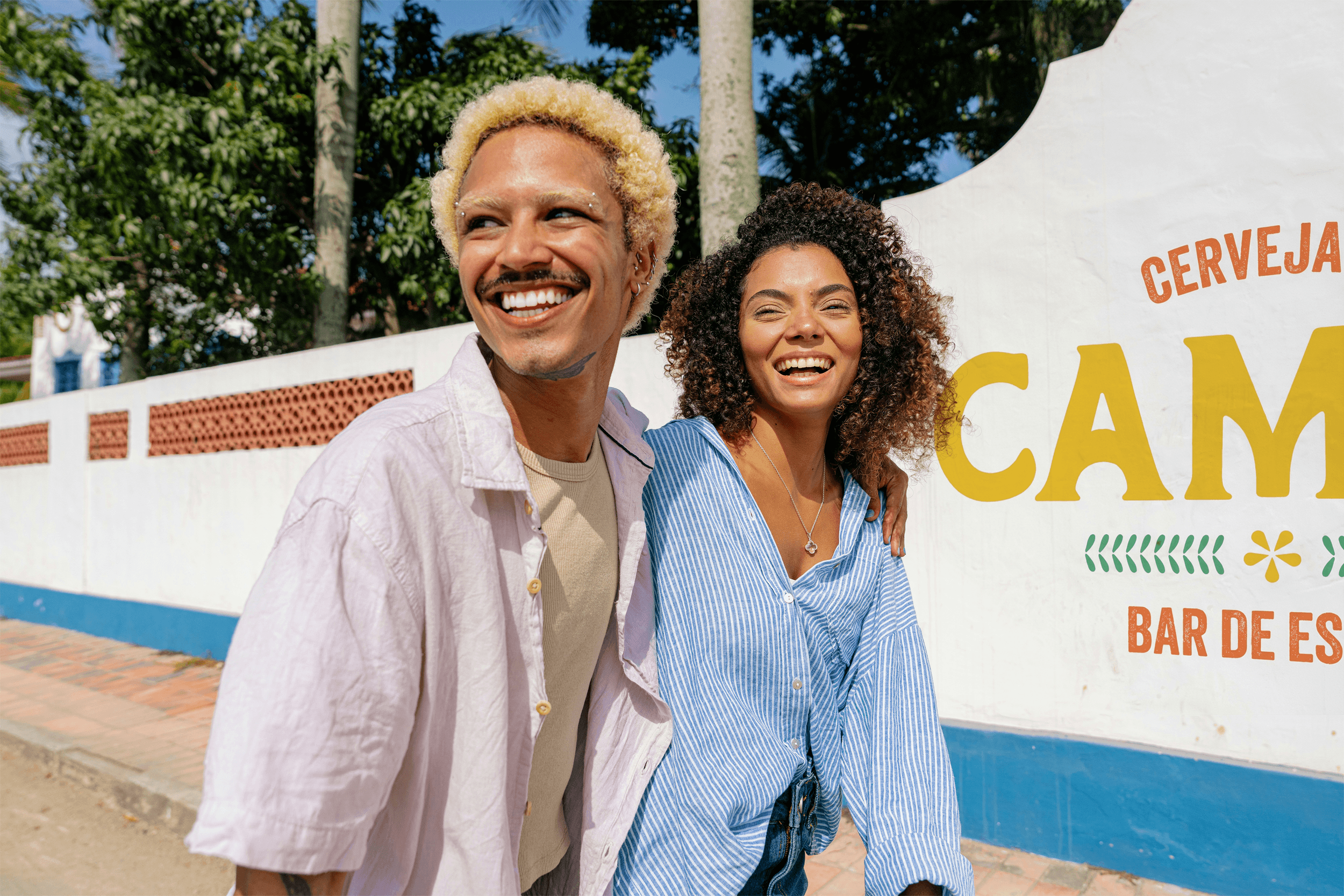
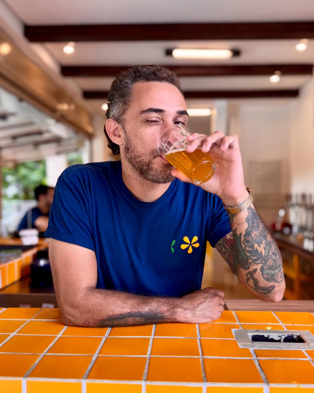
Cambuí is the first brewpub in Brasília's Asa Norte — founded by four partners with years of brewing experience and one shared belief: that a great beer space should feel less like a destination and more like a living room. Named after a native plant whose flowers color the city every September, it was built to be a bar de estar. A bar you don't just visit. One you belong to.
A system,
not a symbol.
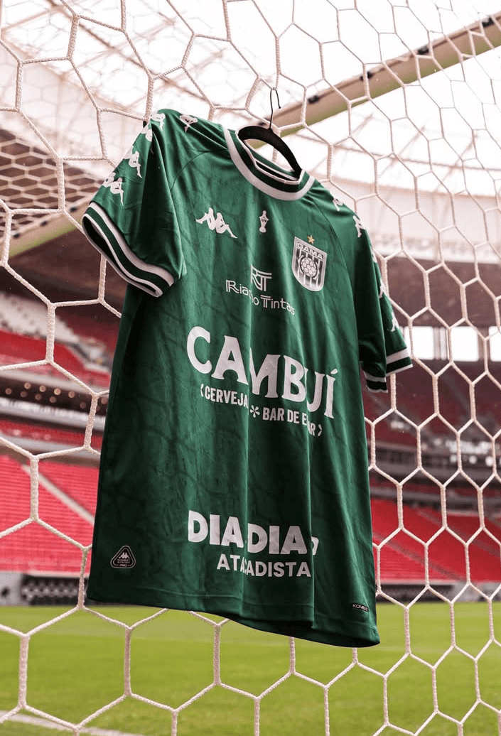
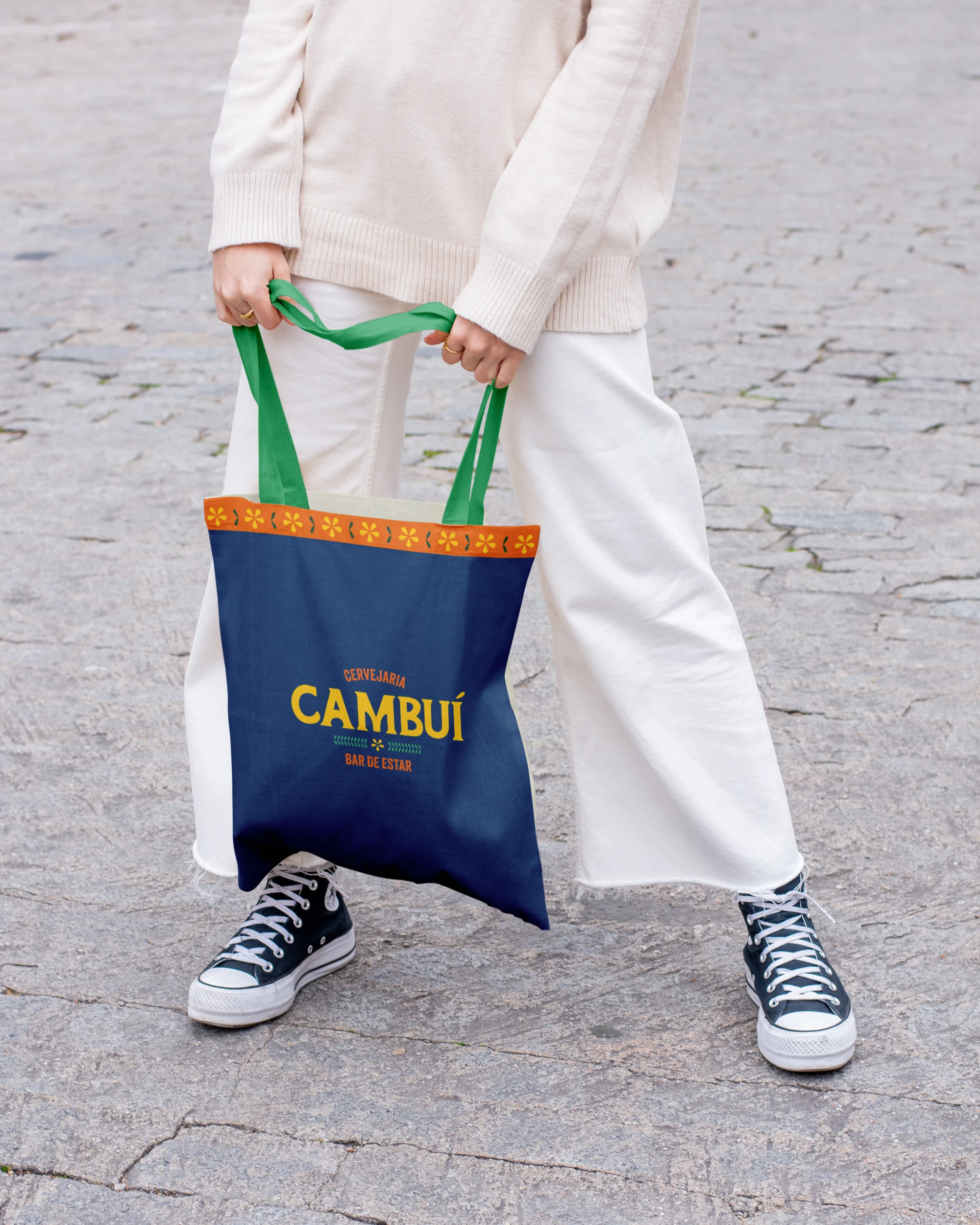
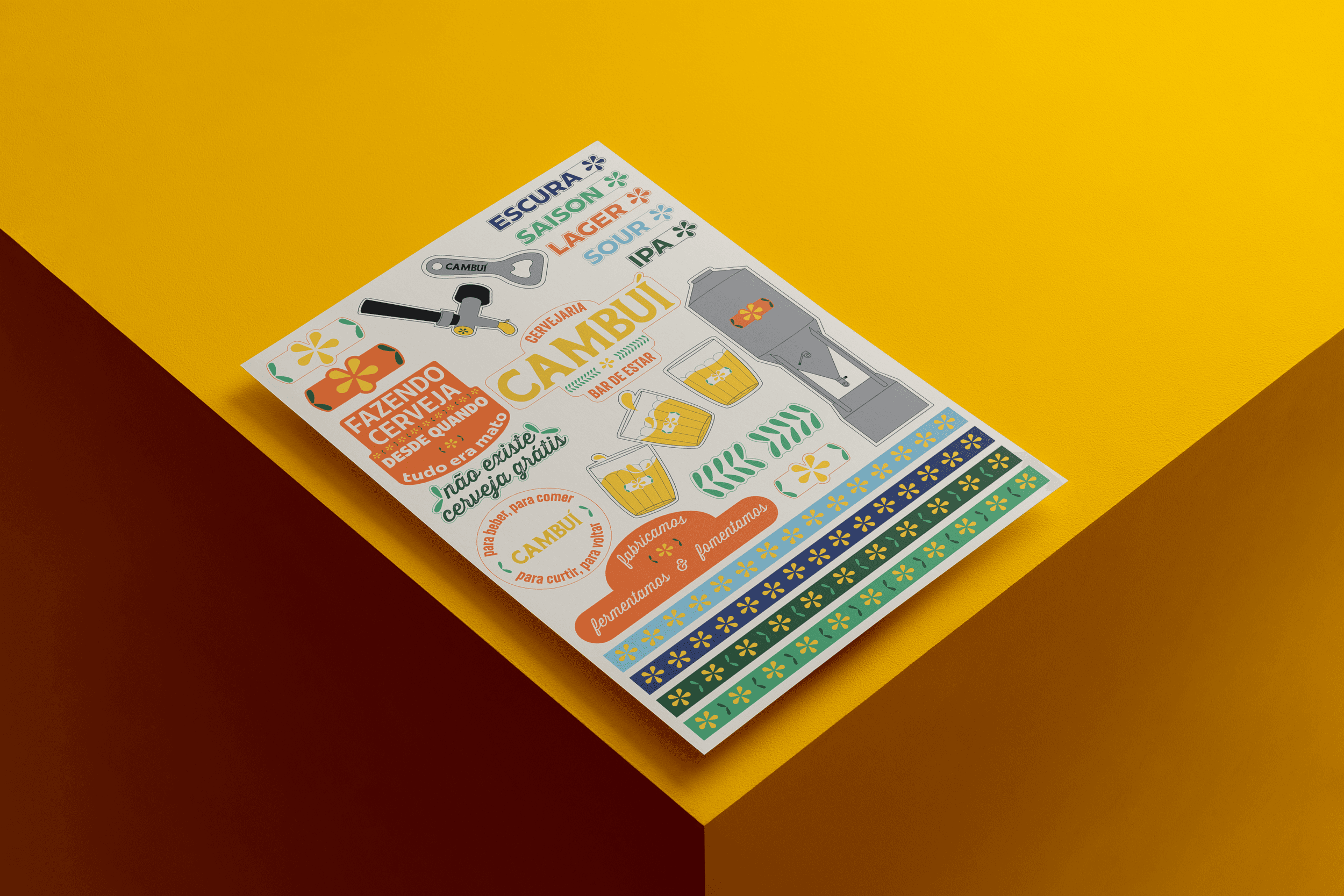
The identity was built as a vocabulary - not a single mark, but a set of elements that work together.
A hand-drawn logotype with a personality entirely its own. A flower symbol that only makes sense alongside its leaves. A palette anchored by Amarelo Cambuí (vivid, warm, impossible to ignore) supported by deep greens, orange, and blue. Illustrations of everyday brewing objects. Patterns that repeat and multiply, echoing the brand's belief in dissemination.
Every piece was designed to be recognizable on its own, but unmistakable as a whole.
Sounds
like home.
Cambuí doesn't speak like a brand. It speaks like the people behind it - four partners who sign their own content, use their own expressions, and show up in person.
The verbal identity is informal, direct, and deeply local. It knows the difference between friendly and corporate, and stays firmly on one side. Because in a bar where everyone feels at home, the voice has to feel that way too.

Cambuí — Visual Identity, Verbal Identity
@Avocado.office
Verbal Identity with Alê Cavendish
Brand Design — 2024


